Monday, November 21, 2011

Stem and Leaf Plot

The plot above is an example of a steam and leaf plot. It is very useful and displaying larger data sets in a simplistic form to view a wide range of variable at one time. The numbers to the right of the column are the first digits of the data and the numbers to the right will be placed on the end to obtain the value. For example in column 14 it would go as 144, 147 and 148.Link to map

Box Plot

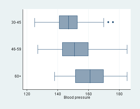
The plot above is a good example of a box plot. A box blot has three areas that must be paid attention to in order to be able to successfully read them. There are three lines in a box plot that represent values the one on the far left, in the middle and on the far right. The one on the left shows the minimum value for the particular category given the one in the middle the median and the one on the right shows the maximum value. Link to map

Histogram

A histogram like the one above is a frequency distribution. It plots data that fall into various categories. Histograms are very useful when looking at data like the one displayed in this graph I believe where scores on an exam or something of the like are plotted in relationship to how frequently they occurred from the chosen sample size. Link to map

Parallel Coordinate Graph

This is an example of a parallel coordinate graph. These graphs are very useful when trying to display and understand a numerous amount of variables. Link to map

Triangular Plot

A triangular plot displays the values of three variables within the confines of a equilateral triangle. This is an example of that practice being used.Link to map

Windrose

A windrose like the one above helps meteorologists determine the wind direction and wind speed. Link to map

Climograph

A climograph is a graph that shows temperature averages and the amount of precipitation that has fallen in an area. The climograph above depicts this information for Iquitos, Peru.Link to map