Monday, November 21, 2011
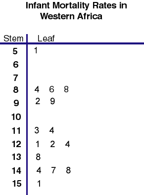
Stem and Leaf Plot
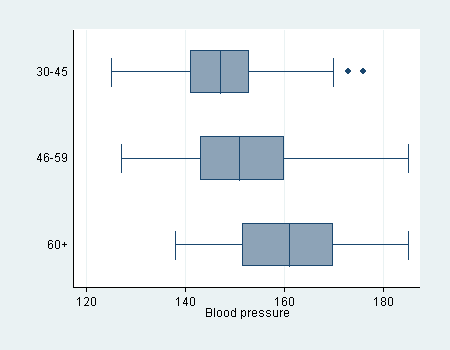
Box Plot
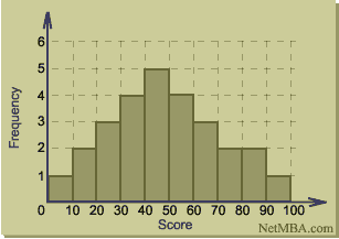
Histogram
Parallel Coordinate Graph

Triangular Plot

Windrose

Climograph

Population Profile

Scatterplots

Index Value Plot

Accumulative Line Graph

Bilateral Graph

Nominal Area Choropleth Map

Unstandardized Choropleth Maps

Standardized Choropleth Maps

Univariate Choropleth Maps

Bivariate Choropleth Maps

Unclassed Choropleth Maps

Range Graded Proportional Circle Map

Continuously Variable Proportional Circle Map

Saturday, November 19, 2011
Classed choropleth maps

The map above is an example of a classed choropleth map of east Africa. According to our notes classed chloropleth maps often display data for states, counties, etc. is combined into a smaller number of groups and portrayed in intervals. I think the map of above is a good representation of this defention.Link to map
DOQQ

DEM

DLG Maps

DRG Map

Isopleths

Isopach

Isohyets

Isotachs

Isobars

Wednesday, November 16, 2011
LIDAR

http://www.google.com/imgres?q=lidar+images&hl=en&gbv=2&biw=1366&bih=532&tbm=isch&tbnid=piJMuN9X0xzn0M:&imgrefurl=http://www.noaanews.noaa.gov/stories/s798.htm&docid=0etJ7XKrMBzbsM&imgurl=http://www.noaanews.noaa.gov/stories/images/manhattan-lidar092701.jpg&w=3764&h=2056&ei=ReTDTrGaKovqtgezhM3eDQ&zoom=1&iact=hc&vpx=897&vpy=174&dur=4726&hovh=166&hovw=304&tx=134&ty=85&sig=107395654614239701683&page=1&tbnh=113&tbnw=206&start=0&ndsp=12&ved=1t:429,r:4,s:0
Doppler Radar

http://www.google.com/imgres?q=Doppler+radar&hl=en&gbv=2&biw=1366&bih=532&tbm=isch&tbnid=D8wseSqkRQ5NHM:&imgrefurl=http://www.buzzle.com/articles/doppler-effect-how-doppler-radar-works.html&docid=E4tRCqpUNyTe8M&imgurl=http://www.buzzle.com/img/articleImages/50916-12.jpg&w=300&h=300&ei=YuDDTtW_LIi3tgfi_5zVDQ&zoom=1&iact=hc&vpx=893&vpy=185&dur=78&hovh=225&hovw=225&tx=91&ty=233&sig=107395654614239701683&page=1&tbnh=140&tbnw=140&start=0&ndsp=14&ved=1t:429,r:12,s:0
Black & White Aerial Photo

http://www.google.com/imgres?q=Black+%26+white+aerial+photo&hl=en&gbv=2&biw=1366&bih=532&tbm=isch&tbnid=XqahgR9pFWb0KM:&imgrefurl=http://www.kodak.com/ek/US/en/Aerial_Industrial_Markets/Aerial_Imaging_Products_and_Services/Aerial_Films.htm&docid=411Wc0QUivR6zM&imgurl=http://www.kodak.com/eknec/documents/89/0900688a802bd489/aerial_film_bw_240.jpg&w=240&h=150&ei=St3DTsbOE5L4tgfpyejHDQ&zoom=1&iact=hc&vpx=895&vpy=273&dur=2543&hovh=120&hovw=192&tx=125&ty=88&sig=107395654614239701683&page=12&tbnh=120&tbnw=192&start=138&ndsp=12&ved=1t:429,r:4,s:138
Infrared Aerial Photo

http://www.google.com/imgres?q=Infrared+aerial+photo&hl=en&gbv=2&biw=1366&bih=532&tbm=isch&tbnid=vkgozlbJi-VKqM:&imgrefurl=http://www.geology.iupui.edu/academics/classes/g303/Image_Interp/remote_sensing.htm&docid=6etjHP5v_BWJjM&imgurl=http://www.geology.iupui.edu/academics/classes/g303/Image_Interp/images/infrared.jpg&w=1200&h=742&ei=39rDTvOoIMvWtwft_-3IDQ&zoom=1&iact=rc&dur=655&sig=107395654614239701683&page=1&tbnh=119&tbnw=192&start=0&ndsp=10&ved=1t:429,r:6,s:0&tx=123&ty=46
Cartographic Animations
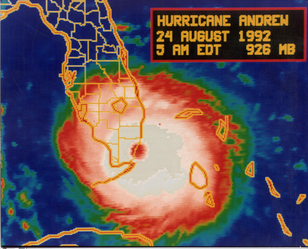
This is a good example of a cartographic animation which has most if not all of the characteristics of a cartographic animation. One of those characteristics is having animation on a map. This would classify as a map of southern Florida and even though this is just a picture this would be able to be animated and show one what the track of this Hurricane had done in the past and what it is predicted to do in the future and obviously where it is at present time.
http://www.google.com/imgres?q=pics+of+hurricane+andrew&hl=en&gbv=2&biw=1366&bih=532&tbm=isch&tbnid=9DrREiFpT8RKhM:&imgrefurl=http://www.nhc.noaa.gov/1992andrew.html&docid=6u7cDeRSwTESgM&imgurl=http://www.nhc.noaa.gov/gifs/1992andy1.gif&w=1024&h=828&ei=jtjDTq2ROoWHtwezu_EP&zoom=1&iact=hc&vpx=192&vpy=154&dur=1903&hovh=202&hovw=250&tx=140&ty=130&sig=107395654614239701683&page=1&tbnh=155&tbnw=192&start=0&ndsp=10&ved=1t:429,r:0,s:0
Tuesday, November 15, 2011
Statistical Maps
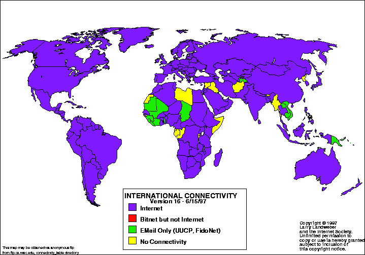
http://www.google.com/imgres?q=Statistical+maps&hl=en&sa=G&biw=1366&bih=532&gbv=2&tbm=isch&tbnid=8zkjRi3C-jMGjM:&imgrefurl=http://personalpages.manchester.ac.uk/staff/m.dodge/cybergeography/atlas/census.html&docid=EboCysSAvh1o7M&imgurl=http://personalpages.manchester.ac.uk/staff/m.dodge/cybergeography/atlas/landweber_version_16.gif&w=719&h=503&ei=yJLCTsWQDoLctwea46H-BQ&zoom=1&iact=hc&vpx=610&vpy=162&dur=3931&hovh=188&hovw=269&tx=48&ty=142&sig=107395654614239701683&page=1&tbnh=158&tbnw=226&start=0&ndsp=10&ved=1t:429,r:2,s:0
Cartograms
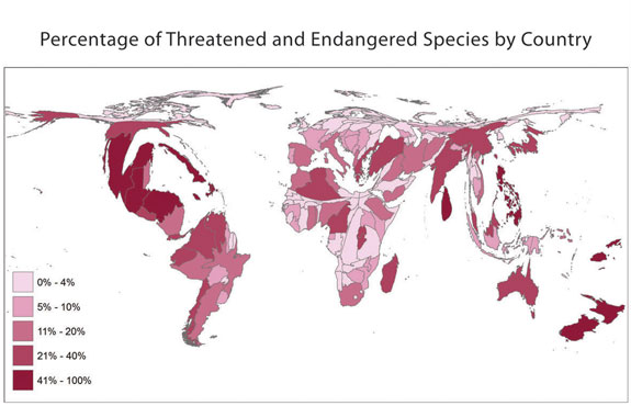
http://www.google.com/imgres?q=Cartograms&hl=en&gbv=2&biw=1366&bih=532&tbm=isch&tbnid=wAB_-ucEEMlJNM:&imgrefurl=http://amphibiaweb.org/amphibian/cartograms/&docid=NHMotSnqfAJILM&imgurl=http://amphibiaweb.org/amphibian/cartograms/cart_threatenedpercentage.jpg&w=575&h=370&ei=II_CTsTMG9O4tgeOx5XUDQ&zoom=1&iact=hc&vpx=363&vpy=232&dur=3479&hovh=180&hovw=280&tx=144&ty=155&sig=107395654614239701683&page=1&tbnh=117&tbnw=182&start=0&ndsp=12&ved=1t:429,r:7,s:0
Flow Maps

http://www.google.com/imgres?q=%22Flow+maps%22&hl=en&gbv=2&biw=1366&bih=532&tbm=isch&tbnid=2s1uWKO31ITCpM:&imgrefurl=http://rectorgis.blogspot.com/2010/03/week-9-flow-maps.html&docid=eVO5Eiz0W9-2aM&imgurl=https://blogger.googleusercontent.com/img/b/R29vZ2xl/AVvXsEhznfR_DgFp2HFjuHVGGZ4pa49oO-0mk_C_GxSoOnz5eqPlmkBfagJjB8I7slWoBfCnP_yL7nuAgIs08F26_CDOHaXWLjT5hslcDgx3jBt-xyWFEyLiHnUWJ031mmUsfV-ldQDVtIUFMY11/s1600/flow.jpg&w=1600&h=972&ei=24vCTv3PKIqDtgf7yfjZDQ&zoom=1&iact=hc&vpx=464&vpy=247&dur=187&hovh=175&hovw=288&tx=143&ty=85&sig=107395654614239701683&page=9&tbnh=123&tbnw=202&start=96&ndsp=12&ved=1t:429,r:1,s:96
Isoline Maps
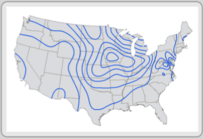
http://www.google.com/imgres?q=%22Isoline+maps%22&hl=en&gbv=2&biw=1366&bih=532&tbm=isch&tbnid=htbwrmZw7kX_TM:&imgrefurl=http://giscommons.org/%3Fpage_id%3D18&docid=pA982qCYSbAw_M&imgurl=http://giscommons.org/files/2009/08/6.41.gif&w=406&h=276&ei=PIjCTsCcLce2tgfEo82pDQ&zoom=1&iact=hc&vpx=511&vpy=243&dur=94&hovh=185&hovw=272&tx=174&ty=96&sig=107395654614239701683&page=2&tbnh=122&tbnw=180&start=12&ndsp=12&ved=1t:429,r:2,s:12
Proportional Circle Maps

http://www.google.com/imgres?q=Proportional+circle+maps&hl=en&gbv=2&biw=1366&bih=532&tbm=isch&tbnid=-dCGBuNMLQOwmM:&imgrefurl=http://www.abc-clio.com/ODLIS/odlis_g.aspx&docid=ugsoAZMRhFCESM&imgurl=http://faculty.frostburg.edu/geog/kessler/geog310/CirGood.jpg&w=1023&h=755&ei=P4XCTrjZC47rtgfYgKGODg&zoom=1&iact=hc&vpx=330&vpy=187&dur=5881&hovh=193&hovw=261&tx=189&ty=114&sig=107395654614239701683&page=8&tbnh=138&tbnw=187&start=89&ndsp=12&ved=1t:429,r:7,s:89
Choropleth Maps

http://www.google.com/imgres?q=Choropleth+maps&hl=en&gbv=2&biw=1366&bih=532&tbm=isch&tbnid=-KaRF6OwXrSVtM:&imgrefurl=http://atschool.eduweb.co.uk/kingworc/departments/geography/asgraphmapskills.htm&docid=cb1p9GC_hh7_6M&imgurl=http://atschool.eduweb.co.uk/kingworc/departments/geography/images/choroplethmapskills.jpg&w=332&h=228&ei=Q4LCTpmFGcHAtgfAgpHHDQ&zoom=1&iact=hc&vpx=901&vpy=229&dur=4731&hovh=182&hovw=265&tx=191&ty=118&sig=107395654614239701683&page=1&tbnh=130&tbnw=189&start=0&ndsp=12&ved=1t:429,r:10,s:0
Dot Distribution Maps

https://www.e-education.psu.edu/natureofgeoinfo/book/export/html/1553
Propaganda Maps

https://www.msu.edu/~wandless/NaziPropaganda1.html
Hypsometric Maps

http://www.google.com/imgres?q=hypsometric+map&hl=en&biw=1366&bih=532&gbv=2&tbm=isch&tbnid=BvFR9qvftoRLXM:&imgrefurl=http://www.csulb.edu/~rodrigue/geog140/lectures/symbolism.html&docid=XvVf2q_zbwXA2M&imgurl=http://www.uidaho.edu/biogeochemistry/images/mickey_hs_contour.gif&w=370&h=267&ei=HnvCTtSxD5CItwei0ZnDDQ&zoom=1&iact=hc&vpx=321&vpy=183&dur=983&hovh=191&hovw=264&tx=164&ty=119&sig=107395654614239701683&page=16&tbnh=129&tbnw=172&start=188&ndsp=15&ved=1t:429,r:1,s:188
PLSS Maps

http://www.google.com/imgres?q=PLSS+maps&hl=en&biw=1366&bih=532&gbv=2&tbm=isch&tbnid=LjRv6N5jIw29sM:&imgrefurl=http://www.utah.gov/maps/&docid=jjEIRMatx4CGWM&imgurl=http://www.utah.gov/maps/images/map-thumb-plss.png&w=340&h=314&ei=wnXCTvmxOsuUtwelgZG5DQ&zoom=1&iact=rc&dur=47&sig=107395654614239701683&page=3&tbnh=146&tbnw=158&start=24&ndsp=12&ved=1t:429,r:2,s:24&tx=75&ty=80
Saturday, November 12, 2011
Cadastral Maps
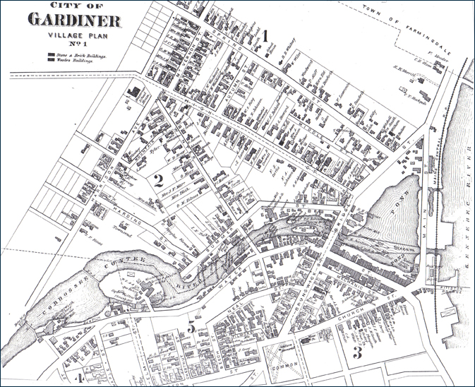
http://www.google.com/imgres?q=cadastral+maps&hl=en&gbv=2&biw=1366&bih=532&tbm=isch&tbnid=GM6RsG5B15oxpM:&imgrefurl=http://www.earobinson.com/pages/contextual_history.html&docid=HGUnBVDHOBBStM&imgurl=http://www.earobinson.com/images/SupportImages/Image_20.jpg&w=673&h=548&ei=ZpS-TqemGdOK2QXN4Y2zBQ&zoom=1&iact=hc&vpx=602&vpy=208&dur=3572&hovh=203&hovw=249&tx=170&ty=124&sig=107395654614239701683&page=5&tbnh=143&tbnw=176&start=49&ndsp=12&ved=1t:429,r:8,s:49
Thematic Maps

http://www.google.com/imgres?q=Thematic+maps&hl=en&sa=G&biw=1366&bih=532&gbv=2&tbm=isch&tbnid=-s7cJs0nxUUviM:&imgrefurl=http://www.gigawiz.com/thematic.html&docid=E_mN0IsmluKC7M&imgurl=http://www.gigawiz.com/images9/thematic1.jpg&w=352&h=267&ei=uJO-TuOkGMjE2QWZnrGYBQ&zoom=1&iact=rc&dur=250&sig=107395654614239701683&page=2&tbnh=140&tbnw=184&start=13&ndsp=12&ved=1t:429,r:6,s:13&tx=111&ty=58
Topographic Map

http://www.google.com/imgres?q=topographic+maps&hl=en&biw=1525&bih=594&gbv=2&tbm=isch&tbnid=U8aOauVcrpGXYM:&imgrefurl=http://en.wikipedia.org/wiki/Topographic_map&docid=yLL8DxIwpAiDhM&imgurl=http://upload.wikimedia.org/wikipedia/commons/thumb/7/79/Topographic_map_example.png/300px-Topographic_map_example.png&w=300&h=300&ei=hIi-TsbsOcry2QWlmey9BQ&zoom=1&iact=rc&dur=62&sig=107395654614239701683&page=1&tbnh=111&tbnw=111&start=0&ndsp=27&ved=1t:429,r:0,s:0&tx=36&ty=61
Tuesday, November 8, 2011
Planimetric Map

This has the correct characteristics to qualify as a planimertric map for multiple reasons. The first being that it shows no relief features. Meaning the map does not contain information about different elevations of the contents contained inside the map. The next reason it qualifies is it maps out many features that are generally found when looking at a planimertic map for example, it shows roads going through the area along with many features located off these roads that can best be described as houses, bus stations and different areas normally found within a city.
Mental Map

Subscribe to:
Comments (Atom)